Code based data definitions are a core concept in Cofoundry. The ability to define simple C# classes to represent your content manageable data provides incredible flexibility while at the same time being simple to implement and a natural fit for a developer workflow.
In our last release we added the ability to define data model classes that can be referenced inside other data model. This technique that can be used to create rich data structures for your custom entities and page block types, with a dynamically generated editor interface.
In this article I'm going to run through some examples of the different ways this feature can be used.
Building a carousel block type
Opinion may be divided on whether carousels are good UX, but they are a familiar design element and they are a good way to demonstrate nested content.
For this example I'll create a simple carousel block type that contains a collection of slides, each with an image, a title and a short description. Styling the carousel isn't the focus of this example, so we'll just use the familiar bootstrap theme to make it functional.
Here's what the finished carousel will look like:

Note that the full source code for this example can be found in the Cofoundry.Samples.PageBlockTypes sample repo.
Defining the nested data model
First I'll define the data model that will be used to store the data for each item in the carousel. This class must inherit from INestedDataModel, which is a simple marker interface that allows this class to be nested inside other data models.
using System.ComponentModel.DataAnnotations;
using Cofoundry.Domain;

public class CarouselSlideDataModel : INestedDataModel
{
    [Display(Description = "Image to display as the background to the slide.")]
    [Required]
    [Image]
    public int ImageId { get; set; }

    [Required]
    [Display(Description ="Title to display in the slide.")]
    [MaxLength(100)]
    public string Title { get; set; }

    [Display(Description ="Formatted text to display in the slide.")]
    [Required]
    [Html(HtmlToolbarPreset.BasicFormatting)]
    public string Text { get; set; }
}
Aside from inheriting from INestedDataModel, the class is built in the same way as any other Cofoundry data model using C# properties and data annotations. You can find a full list of available data annotations in our documentation
Defining the block type data model
Next I'm going to create a data model for the carousel block type. This is the same as defining any other block type, except I'm using the [NestedDataModelCollection] data annotation to create a property that accepts a collection of our carousel slide nested data model type.
using Cofoundry.Domain;
using System.Collections.Generic;
using System.ComponentModel.DataAnnotations;

public class CarouselDataModel : IPageBlockTypeDataModel
{
    [NestedDataModelCollection(IsOrderable = true, MinItems = 2, MaxItems = 6)]
    public ICollection<CarouselSlideDataModel> Slides { get; set; }
}
There's a few extra parameters that can used here to alter the behavior of the property:
- IsOrderable: Adds drag and drop ordering to the collection in the editor
- MinItems: Validates that a minimum number of items are added to the collection
- MaxItems: Validates a maximum number of items that can be added to the collection.
Defining a block type display model
The block type display model is the model that is used by the view to render the block template. For simplicity you could just use the CarouselDataModel as your display model by directly inheriting from IPageBlockTypeDisplayModel, but defining a separate display model with a custom mapper enables you to optimize data mappings and control how the data is transformed before rendering.
In particular for the carousel it would be optimal to fetch the image data for all the slides at once. First I'll define the display models:
using Cofoundry.Domain;

public class CarouselDisplayModel : IPageBlockTypeDisplayModel
{
    public ICollection<CarouselSlideDisplayModel> Slides { get; set; }
}

public class CarouselSlideDisplayModel
{
    public string Title { get; set; }

    public string Text { get; set; }

    public ImageAssetRenderDetails Image { get; set; }
}
Next I'll define a mapper that fetches the image data in bulk and then maps them to the display models:
using Cofoundry.Core;
using Cofoundry.Domain;
using System.Collections.Generic;
using System.Linq;
using System.Threading.Tasks;

public class CarouselDisplayModelMapper : IPageBlockTypeDisplayModelMapper<CarouselDataModel>
{
    private readonly IImageAssetRepository _imageAssetRepository;

    public CarouselDisplayModelMapper(
        IImageAssetRepository imageAssetRepository
        )
    {
        _imageAssetRepository = imageAssetRepository;
    }

    public async Task<IEnumerable<PageBlockTypeDisplayModelMapperOutput>> MapAsync(
            IReadOnlyCollection<PageBlockTypeDisplayModelMapperInput<CarouselDataModel>> inputCollection,
            PublishStatusQuery publishStatusQuery
        )
    {
        // Find all the image ids to load
        var allImageAssetIds = inputCollection
            .SelectMany(m => m.DataModel.Slides)
            .Select(m => m.ImageId)
            .Where(i => i > 0)
            .Distinct();

        // Load image data
        var allImages = await _imageAssetRepository.GetImageAssetRenderDetailsByIdRangeAsync(allImageAssetIds);
        var results = new List<PageBlockTypeDisplayModelMapperOutput>(inputCollection.Count);

        // Map display model
        foreach (var input in inputCollection)
        {
            var output = new CarouselDisplayModel();

            output.Slides = EnumerableHelper
                .Enumerate(input.DataModel.Slides)
                .Select(m => new CarouselSlideDisplayModel()
                {
                    Image = allImages.GetOrDefault(m.ImageId),
                    Text = m.Text,
                    Title = m.Title
                })
                .ToList();

            results.Add(input.CreateOutput(output));
        }

        return results;
    }
}
The mapper is optimized to map multiple block instances, so if you have multiple carousels on one page, they will all be mapped in the same batch. This can be more efficient than mapping one-by-one, but it's up to you if you want to implement the extra code to take advantage of the optimization.
The carousel block type view
The view code is very specific to the bootstrap carousel, but I'll add it here for the sake of completeness:
@model CarouselDisplayModel
@inject ICofoundryBlockTypeHelper<CarouselDisplayModel> Cofoundry
@{
    Cofoundry.BlockType.UseDescription("A carousel of images with titles.");
}

<div id="carouselExample" class="carousel slide" data-ride="carousel">

    @* Indicators *@

    <ol class="carousel-indicators">

        @for (int i = 0; i < Model.Slides.Count; i++)
        {
        <li data-target="#carouselExample" data-slide-to="@i" @Cofoundry.Html.ClassIf(i == 0, "active")></li>
        }
    </ol>

    <div class="carousel-inner">

        @* Slides *@

        @for (int i = 0; i < Model.Slides.Count; i++)
        {
            var item = Model.Slides.ElementAt(i);

        <div class="carousel-item @Cofoundry.Html.TextIf(i == 0, "active")">
            <img class="d-block w-100"
                 src="@Cofoundry.Routing.ImageAsset(item.Image, 600, 300)"
                 alt="@item.Image.Title">
            <div class="carousel-caption d-none d-md-block">
                <h5>@item.Title</h5>
                @Cofoundry.Sanitizer.Sanitize(item.Text)
            </div>
        </div>
        }
    </div>

    @* Buttons *@

    <a class="carousel-control-prev" href="#carouselExample" role="button" data-slide="prev">
        <span class="carousel-control-prev-icon" aria-hidden="true"></span>
        <span class="sr-only">Previous</span>
    </a>
    <a class="carousel-control-next" href="#carouselExample" role="button" data-slide="next">
        <span class="carousel-control-next-icon" aria-hidden="true"></span>
        <span class="sr-only">Next</span>
    </a>
</div>
Adding a new carousel block
The carousel block type is now ready to use. When running the application and adding a new carousel block to a page, I can now add slides to the grid and edit, remove or re-order them.
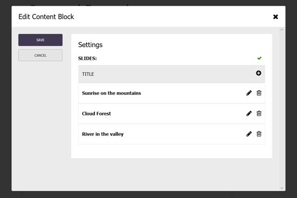
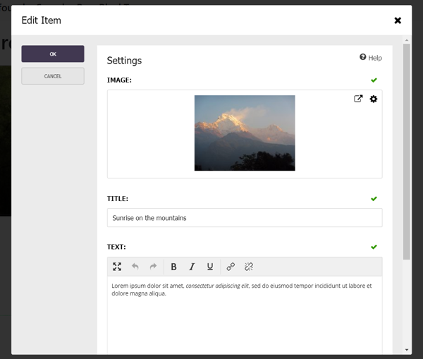
Adding or editing an item brings up the edit form for the nested model:
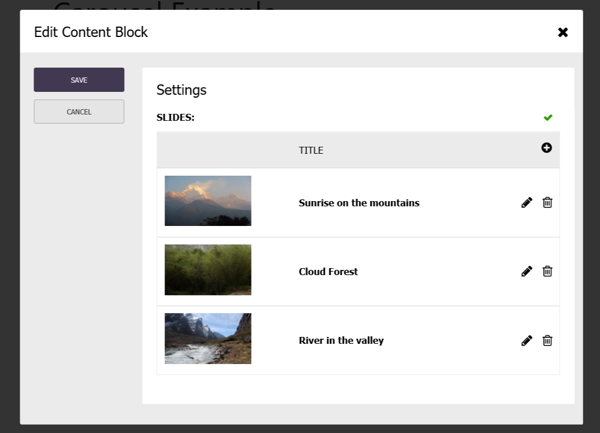
Customizing the grid with preview annotations
The carousel editing experience is looking pretty good, but wouldn't it be nice if I could also show the image in the slides grid as well as the title? Well thanks to another feature we've just added, you can!
The default behavior of the nested data model grid is first to try and display a field named 'Title', otherwise fall-back to labeling the rows sequentially i.e. 'Item 1', 'Item 2', 'Item 3'. This isn't ideal for some scenarios, so we allow you to better describe your display preference by annotating your data model with these preview annotations:
- [PreviewImage]: Annotate an image id property to include it as the first column of the grid.
- [PreviewTitle]: Annotate a string field to display it as the title/identity field.
- [PreviewDescription]: Annotate a string field to display it as an additional description column
So if I update the carousel slide data model to use preview annotations, it would look like this:
public class CarouselSlideDataModel : INestedDataModel
{
    [PreviewImage]
    [Display(Description = "Image to display as the background tot he slide.")]
    [Required]
    [Image]
    public int ImageId { get; set; }

    [PreviewTitle]
    [Required]
    [Display(Description ="Title to display in the slide.")]
    [MaxLength(100)]
    public string Title { get; set; }

    [Display(Description ="Formatted text to display in the slide.")]
    [Required]
    [Html(HtmlToolbarPreset.BasicFormatting)]
    public string Text { get; set; }
}
This results in the grid display an extra image column, which makes it much easier for a user to identify the slide:
Bonus feature: Preview annotations also work with custom entities
While implementing preview attributes for nested data model grids it struck us that these attributes would be really useful for improving the usability of custom entity grids, and so we went ahead and implemented that too.
You can now annotate your custom entity data models with the preview attributes which will affect the custom entity listing page in the admin panel as well as any other data fields that reference them like [CustomEntityCollection] and [CustomEntityMultiTypeCollection].
Building a menu tree using a recursive nested data model
The second example I'd like to talk about is from our freshly updated Cofoundry.Samples.Menus sample, which shows various strategies for creating content managed menus. I won't list out all the code here so dig into the sample repo if you want to see the full code.
The multi-level menu
One of the menu samples is for a multi-level menu where you can add an unlimited number of nested menu levels. Here's what the rendered output of the sample data looks like:

Styling is beyond the scope of the sample, so the menu tree is simply listed out in cascading lists.
How does it work?
The sample has a custom entity definition for the multi-level menu which includes a very simple nested data model that references itself recursively:
public class MultiLevelMenuDataModel : ICustomEntityDataModel
{
    [Required]
    [NestedDataModelCollection(IsOrderable = true)]
    public ICollection<MultiLevelMenuNodeDataModel> Items { get; set; }
}

public class MultiLevelMenuNodeDataModel : INestedDataModel
{
    [Required]
    [MaxLength(30)]
    public string Title { get; set; }

    [Required]
    [Page]
    public int PageId { get; set; }

    [NestedDataModelCollection(IsOrderable = true)]
    public ICollection<MultiLevelMenuNodeDataModel> Items { get; set; }
}
In the admin panel, the editor interface allows you to keep adding nested items using overlaying modal windows for each nested items.
The menu is rendered using an asp.net core View Component, which extracts the page ids from the data model recursively, fetches the page data and then maps the tree using recursion. You can find the source code for the view component here